

Why Help Suck (1 of 2)
17 Jul 2008Ever used the help system? Of course you have. Hated it? Of course you did. No body likes to go into the Help menu and just browse the Help Content. Everybody seems to try to use those other resources (forums, blogs, screen casts, etc.) to learn how to go around the software they’re using. Since this is quite clear, why would you bother build a Help Contents for your software. Most software vendors already know that, yet the only obvious enhancement in Help systems is to make it online. In other words, make it everywhere.
But what’s wrong with Help. I mean we know it’s not the best thing, but what’s exactly is wrong with it.
First, It’s a lot of reading. No body likes to read that much, even book lovers, they read for fun and knowledge not for solving problems. It’s like those emergency instructions, the plane is going down, your hair is on fire and you’re reading the emergency instructions. Users don’t want to read those long pages just to figure out an solution to their problem, they want “Help”. They want answers to their questions, which are most likely not to be included in the frequently asked questions (I don’t know where do these come from anyway).
Second, when users turn to help, they’re looking for answers. That means Search, right? well, CHM (the most used format for help files) have a terrible search capabilities and results. The problem with using plain search for help is it’s not optimized for finding answers for questions. A user should be able to enter a question and get an answer for it. Online help system have better search capabilities but they still lead to the same boring content.
Finally, It’s not that help content is long and unreadable. It’s that “everybody” has to read (or rather scan) it to get any information out of it. A beginner user doesn’t need to know every little detail that a power user might be looking for. Users don’t just want answers to their questions, they also want that answer in a way they understand.
But it’s not like help systems are that bad all the way and no one tried to make them better. Some companies are actually trying. The new Vista help looks pretty good.
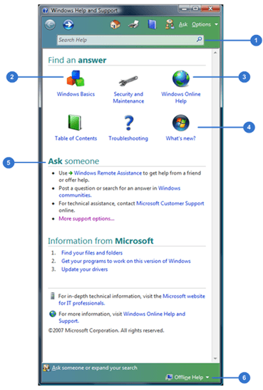
You can see from the snapshot that:
Search is front and center in the help window, it’s your primarily entry point.
Windows Basics is the first item in the “Find an answer” section. Because it’s a help system for Windows which is the most basic thing, the users expected to land here are beginners (and I mean people who need a second to tell the difference between a mouse and a keyboard).
Windows Online Help is important because offline help can’t be updated as online help. It should be reached easily.
Most software application put “What’s New” up front, which is not a topic for help but rather a topic for white papers. Good job to keep the section but put it at the end of the list.
Also, because the expected users are beginners, it’s logical to offer them a chance to contact someone for help.
The offline help sign switch the search box results to include results from online help.
Other help systems include:
- Option to comment on the content page where users can add their own experience and discuss the content of the page.* Social tools to share the content of those pages.* Discussion forums.
All of that seems fine but still not enough. What would it take for a help system not to suck. Let’s leave that to another post.